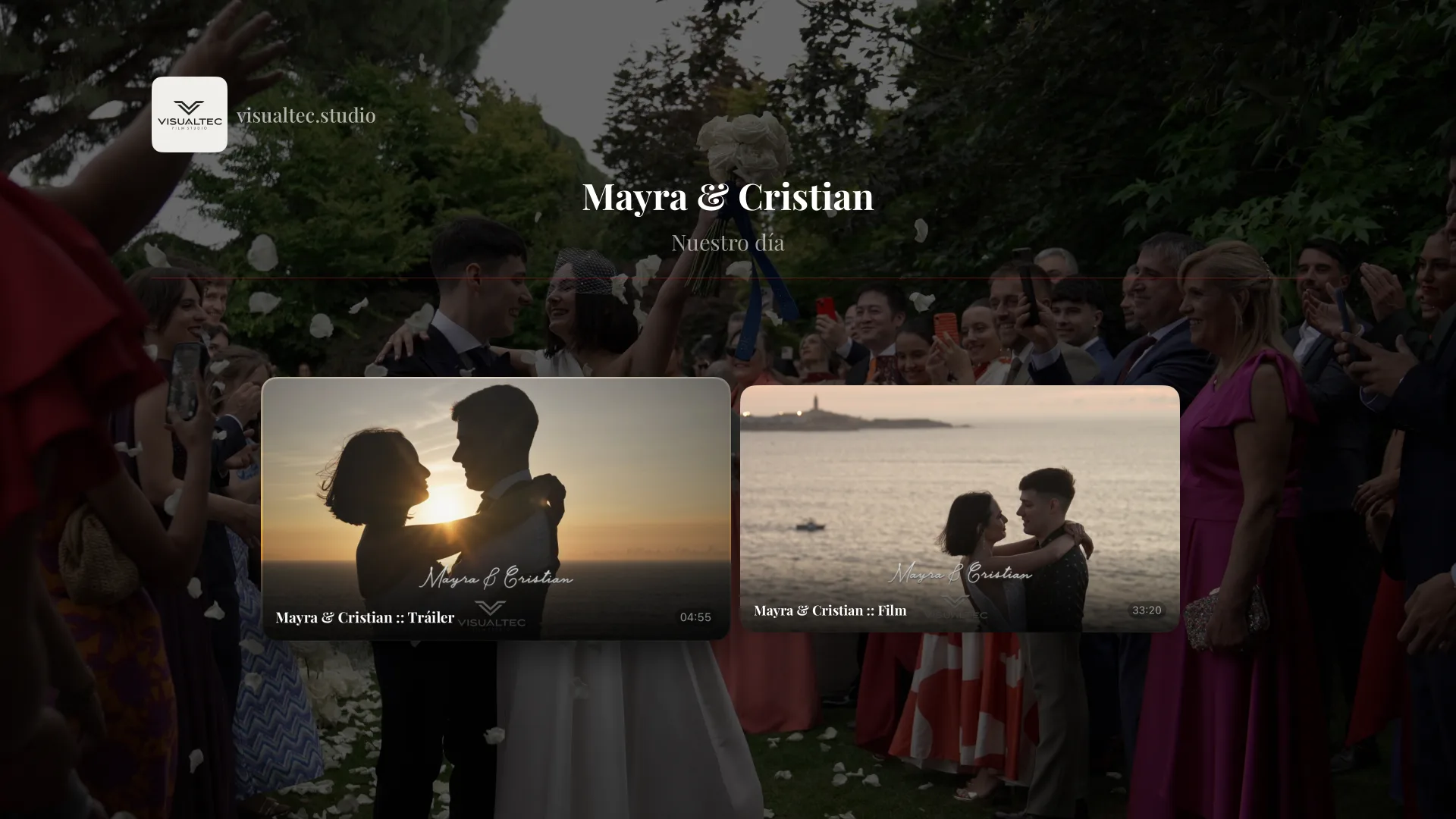
There is a detail in every delivery that almost nobody notices until they see it. You finish a wedding, upload it, send the link. The couple opens it, shows it to the family, shares it with everyone who could not be there. And for all of that time, the player framing your work carries the colour and the logo of a company that is not you.
It is the difference between handing over a bound album with your name on it and handing over the photos in the lab's envelope. The contents are the same. What it says about you is not.
What you can change
From today, the STRIMY player is yours on three fronts: the colour, the design and your logo.
Your accent colour
The progress bar, the controls and the play button take the colour you choose, across every video and every portfolio. If a portfolio already has its own palette, that one wins: each delivery keeps the identity you gave it.
Three designs
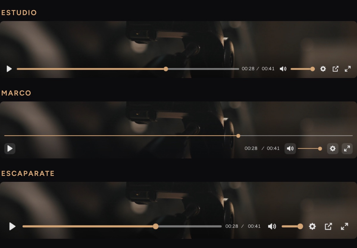
Studio is the classic player, with every control in view. The one you already know.
Frame dresses the controls as chips set away from the edge and moves the progress bar onto its own line. The image breathes and the interface steps aside. It is the one we would choose for a delivery to a couple, where the video is what should be talking.
Showcase enlarges the icons and adds a solid central play button in your colour. Built for portfolio and mobile, where the player makes the first impression before anyone presses play.

Your logo, where you decide
You can overlay it on the image — in whichever corner you prefer, at the size and opacity you choose — or place it inside the control bar, where the platform's own mark normally sits.
Never both at once, and that is deliberate: a logo floating over the video and another in the bar is a watermark, and a watermark is the opposite of a careful delivery.
How to set it up
It all lives on a single screen in your panel, under Player branding. You pick the colour, the template and where the logo goes, with a live preview built on one of your own videos right beside it.
That preview is not an approximation: it is the same player your client will see, with the same controls and the same styles. What you see there is what gets delivered.
And while we were at it: thumbnails as you scrub
Dragging along the timeline now shows the frame at that exact point, the way the big platforms do. Finding the first dance, the moment they walk out of the church, or wherever you want to start showing from, stops being guesswork.
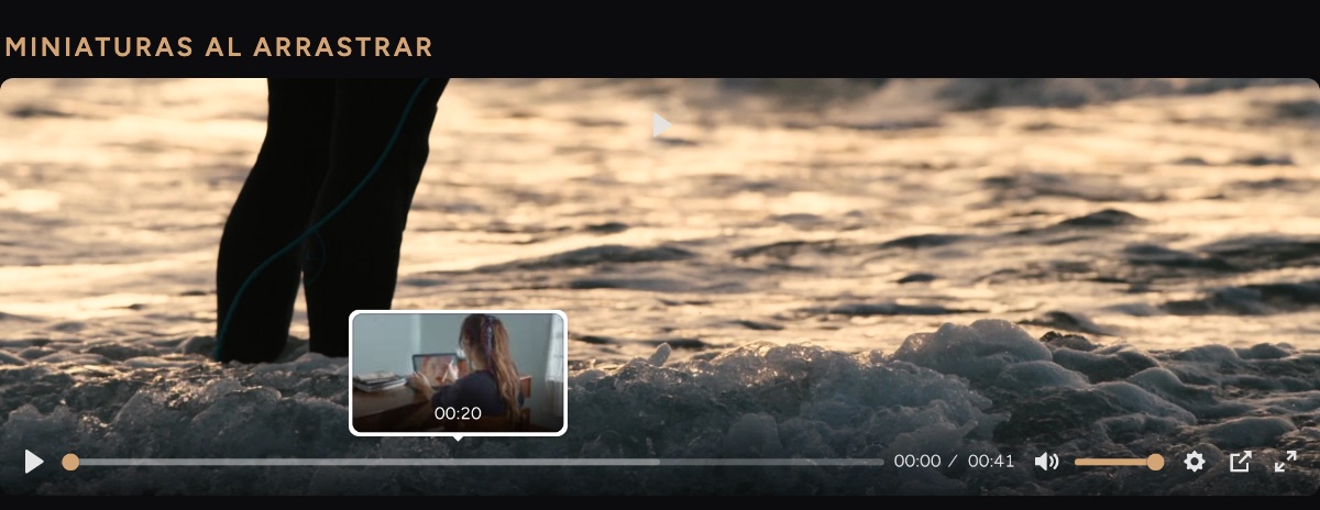
Nothing to switch on or configure: new videos get it as they are uploaded.
What is included in each plan
The colour and the three templates are in every plan, including the trial. They are styling, and styling should not be an add-on.
The logo is part of the white-label plans, for a practical rather than commercial reason: there is only one slot for it, so yours can only take the place where ours stops being.
Why we think this matters
A wedding videographer does not sell video files. They sell the memory of a day, and they sell it whole: the rapport, the wait, the moment of opening the link. That last step has for years been the only one you did not control, because the platform supplied it.
Now you do.